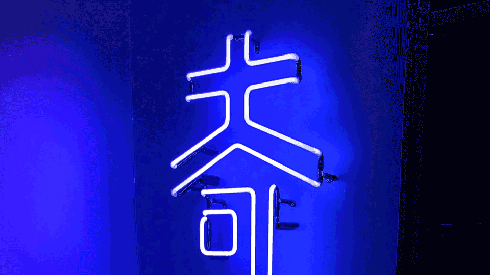


With a very unique Chinese name, the first character "奇” has a definition of surprise and imagination. The second character “墨” means ink – where everything starts with the ink in you pen, every dots or lines your draw, it has the potential to become a piece of art in the end. We want create a visual identity that truly reflects this idea.
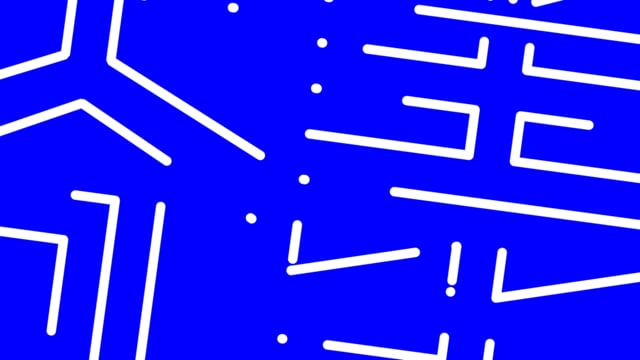
The logo is inspired by the combination of the lines of a floor plan. When the logo is at a different angle, it becomes a brand pattern that is unique and flexible.